My Secret Geneva – Swiss Bliss: A Sweet Review

My Secret Geneva – Swiss Bliss: A Sweet Review

Introduction

Nestled within the pages of Diccon Bewes’s Swisswatching lies a captivating chapter that unravels the mysterious origins of Swiss chocolate, inviting readers on an intriguing exploration of this highly wanted delicacy. In the 19th century, the introduction of milk chocolate by Daniel Peter in 1875 and the subsequent collaboration with Henri Nestlé allowed Swiss chocolate to gain widespread popularity, revolutionizing the industry and solidifying Switzerland’s reputation as a chocolate powerhouse. Delving beyond the borders of Switzerland, this chapter embarks on a sensory quest to trace the journey of chocolate from its humble beginnings to the luxurious Swiss confections that grace global palates. At the bottom of this exploration within our group lies a thought-provoking thesis: the price of Swiss chocolate may not always serve as a reliable indicator of its quality. This chapter is a celebration of heritage, craftsmanship, and the intertwining narratives that have shaped the world of Swiss chocolate. Upon reading this chapter, our team was inspired to conduct an experiment on whether the price of branded Swiss chocolate is worth paying for. The experiment includes visiting four chocolate stores in Geneva, tasting different chocolates, considering the prices, taste and quality to be able to compare which chocolate is really worth its price tag.

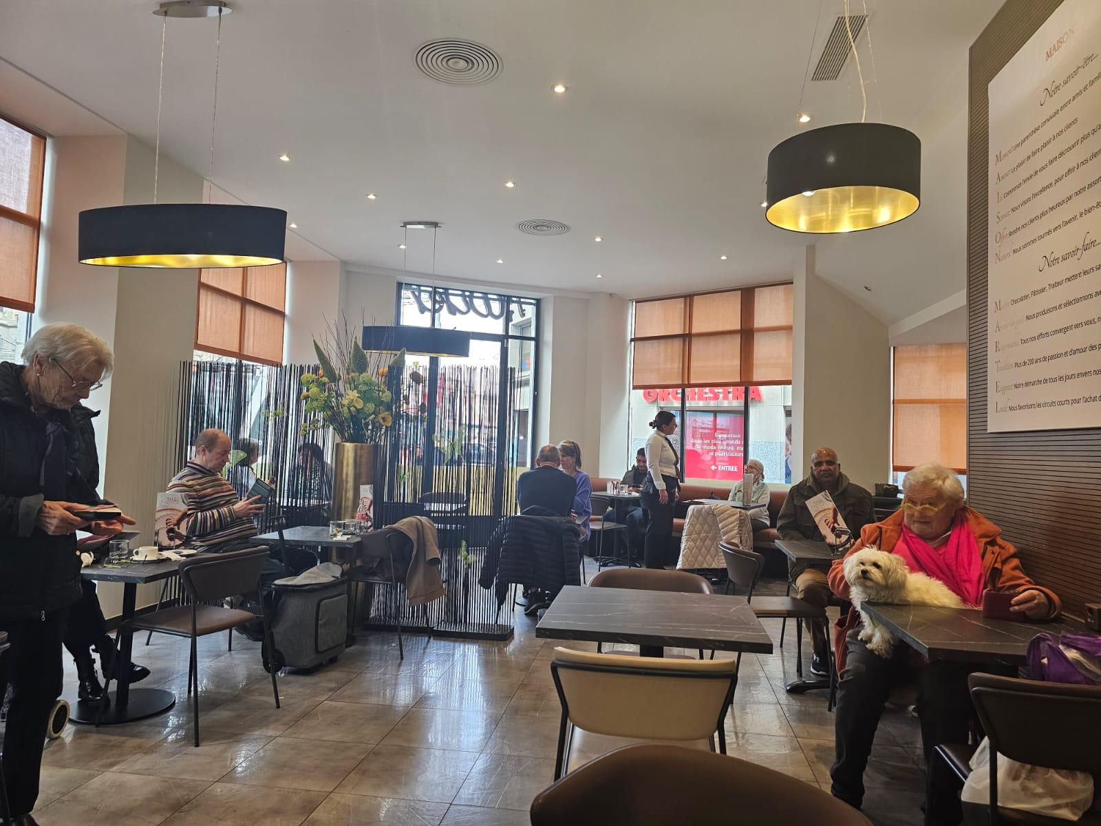
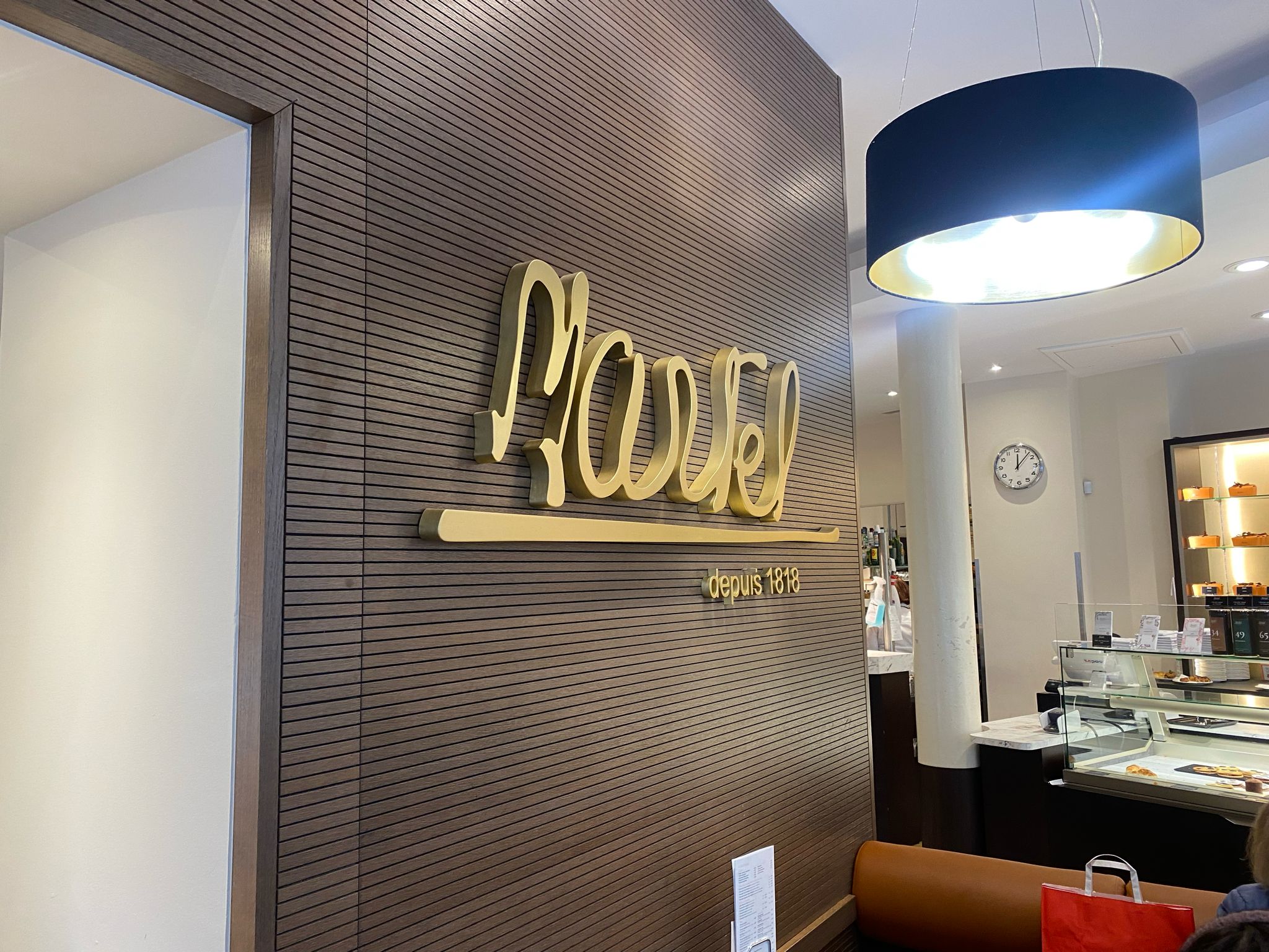
The first location we tried was Martel Chocolatier at Rue de Cornavin 16 1201, Geneva. The store was easy to access as it is very close to Manor and visibly sticks out thanks to its clear window displays. Our overall experience was somewhat negative as the employees seemed to be dismissive of customers. They didn’t ask us if we needed any help or recommendations and quickly prioritized the french speaking customers. It appears the employees were rushed and didn’t aim to offer any special experience. The seating area was pretty full and loud making the atmosphere stuffy and a bit chaotic which wasn’t helped by the absence of music playing to drown out any noise. Comfort wise the tables were small and the chairs were of a plastic quality which didn’t make us want to stay very long. In terms of design, the look of the store is minimalistic with a gray and gold tone theme as well as large windows bringing in natural light to the store.

As for the chocolate, the taste is slightly above average. In our subjective opinion the chocolate tasted very artificially sweet with a strong aftertaste. The texture was hard at the first bite but became sandy as we chewed. For 11 francs the quality could have been better. There were no pre packaged bars as they offer asymmetrical cut pieces that are then weighed to determine the price. To put it into perspective, for the same price we could have bought approximately four more Lindt bars (2,50 francs). Packaging wise, no bag was offered aside from a thin plastic bag closed by a sticker.

Overall Ratings

Customer service: 4/10

Atmosphere: 5/10

Comfort: 4/10

Design: 6/10

Taste: 6/10

Texture: 6/10 (sandy)

Quality based on price: 5/10

Packaging: 2/10
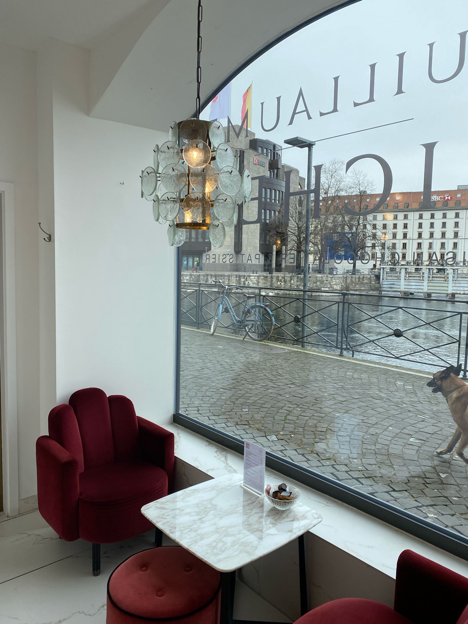
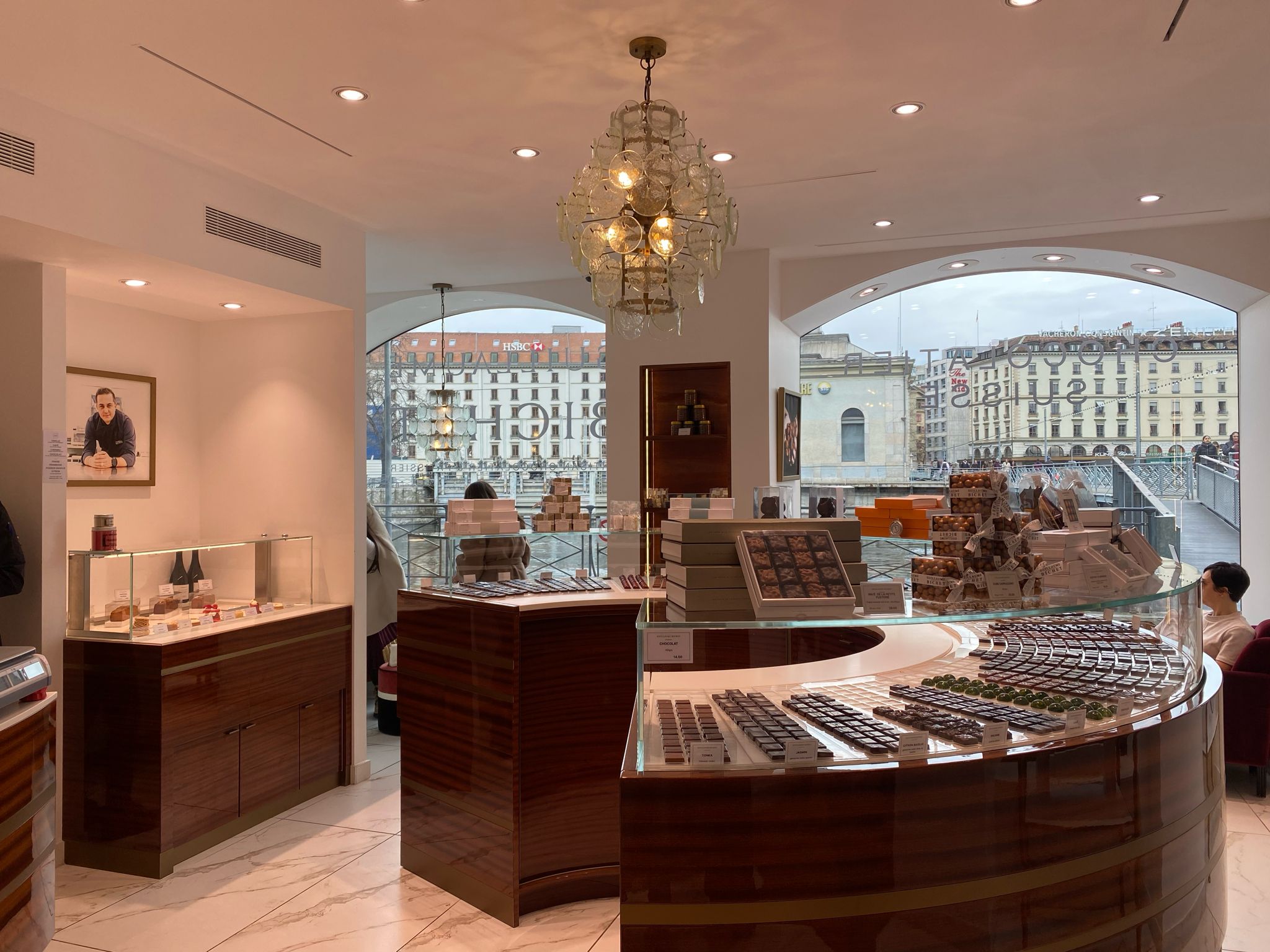
The second store that we visited was Guillaume Bichet, located in Rue du Rhone 17, 1204 Geneve. It was not easily located as it is overshadowed by the construction taking place just in front. We were welcomed warmly the second we entered the store by the employees. We started looking at the chocolates that were arranged nicely. After a few moments, the lady kindly offered us to taste one of their most popular products, the “Almond Princesses” which are chocolate covered almonds. After which, we purchased the chocolate. We then asked them if we could take pictures from their store and interview them, which they gladly agreed to, since they were so easy going and polite to the customers. Their nice and warm behavior made us feel free and comfortable to come up with our questions and inquiries about their store and job. The atmosphere of the store was quite pleasing as it was located near the lake and the limited number of seats led to a quiet and intimate atmosphere. Classical music could be heard which added to this ambience of leisure. Comfort wise, the chairs are plush, covered in a velvet material, making the store look luxurious. The view from the window of the lake only enhances this comfort, encouraging customers to stay longer. The design of the store is sleek with brown and white themed displays accompanied by many glass displays of their products.

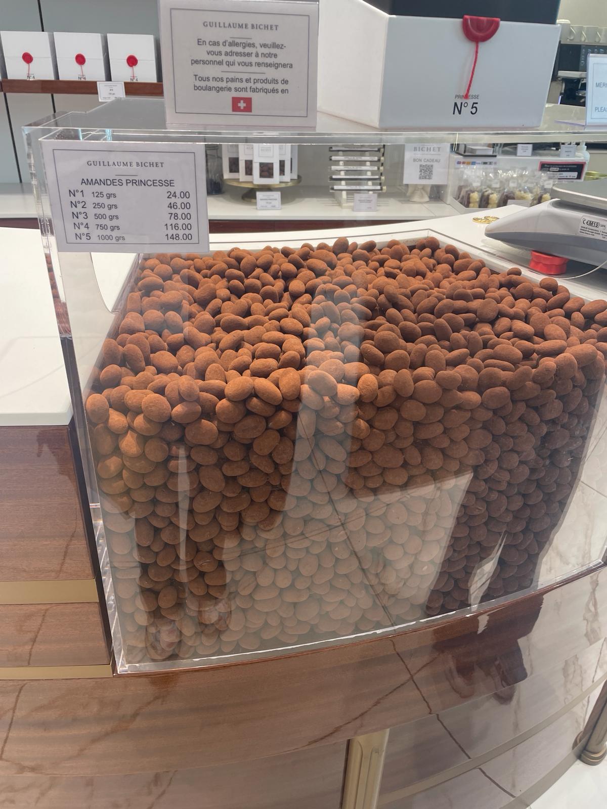
In terms of taste, the chocolate was not overpoweringly sweet however the flavor was a bit muted. The texture was creamy and easy to chew. In our opinion, the chocolate was appropriately priced at 11 francs seeing as the store seems to be more catered to higher class customers. In terms of packaging, they kept it quite simple with a smooth white paper box with a plastic cutout showing the chocolate.
Overall Ratings

Customer service: 10/10

Atmosphere: 8/10

Comfort: 6/10

Design: 8/10

Taste: 7/10

Texture: 8/10 (creamy)

Quality based on price: 7/10

Packaging: 8/10
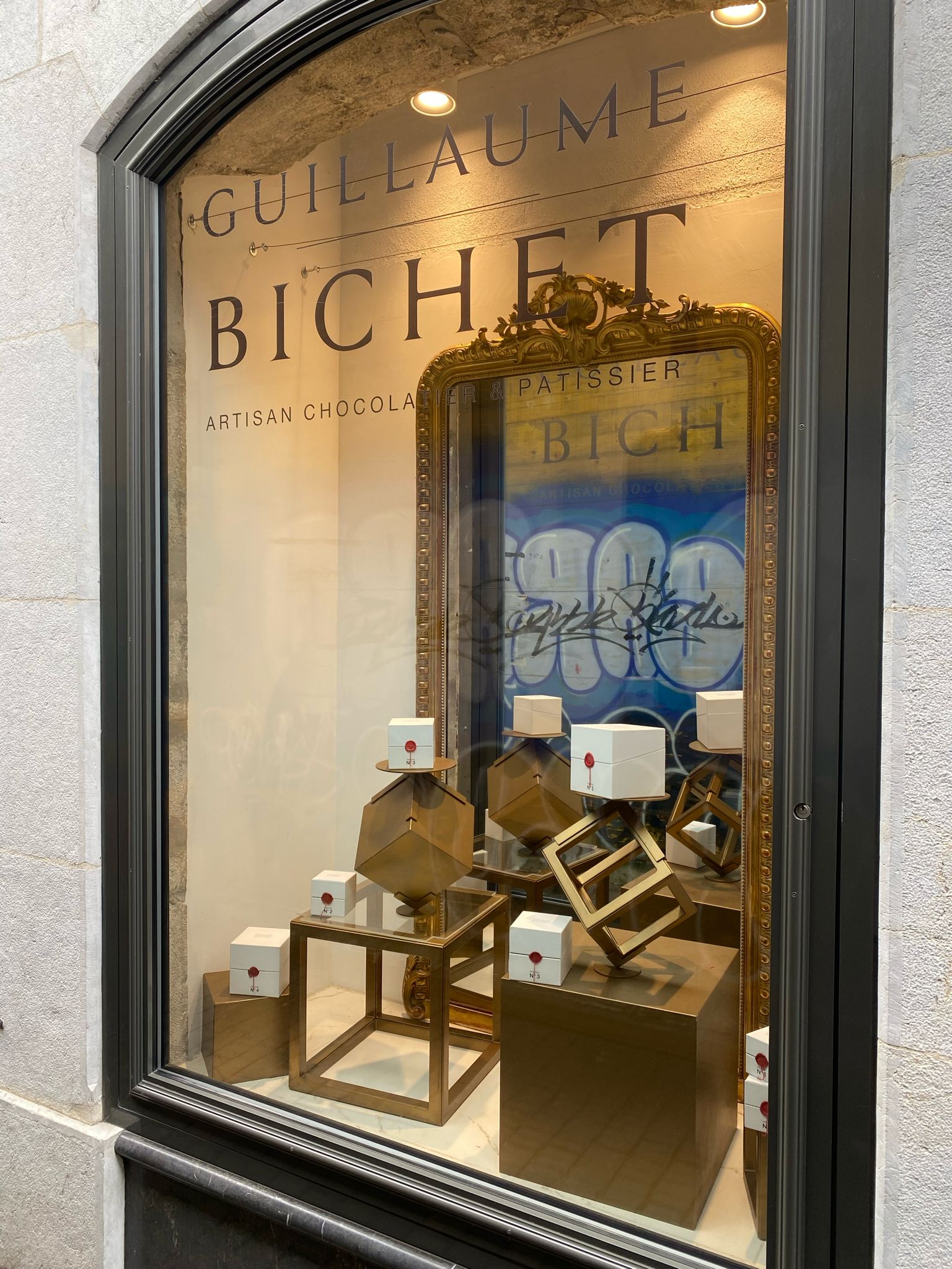
Guillaume Bichet: Employee Interview

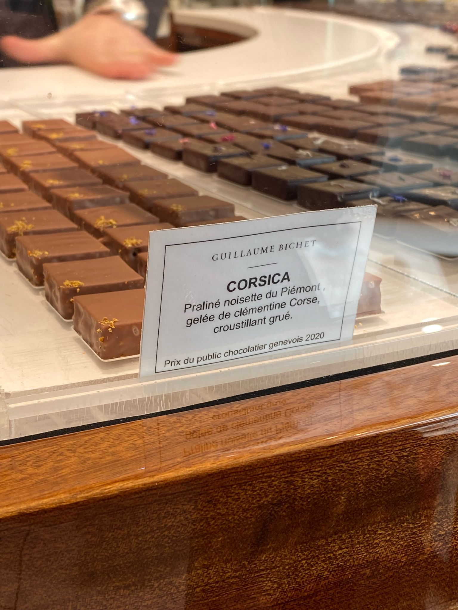
As the Guillaume Bichet employees were the most welcoming and patient ones, we decided to interview them and inquire about their products. We asked about their most sold chocolate, which was the “Almond Princesses”. We asked one of the staff members to see if they have any personal favorite chocolate and it turned out it was not really a popular chocolate within the store, named “Corsica” which is a praline chocolate. Regarding the origins of the chocolates, we found out their chocolates are produced in a factory in Versoix by specialists and are then delivered to the store. In terms of what differentiates their store from others they emphasized on the elegance they offer in their design with muted color schemes and an elevated customer experience.
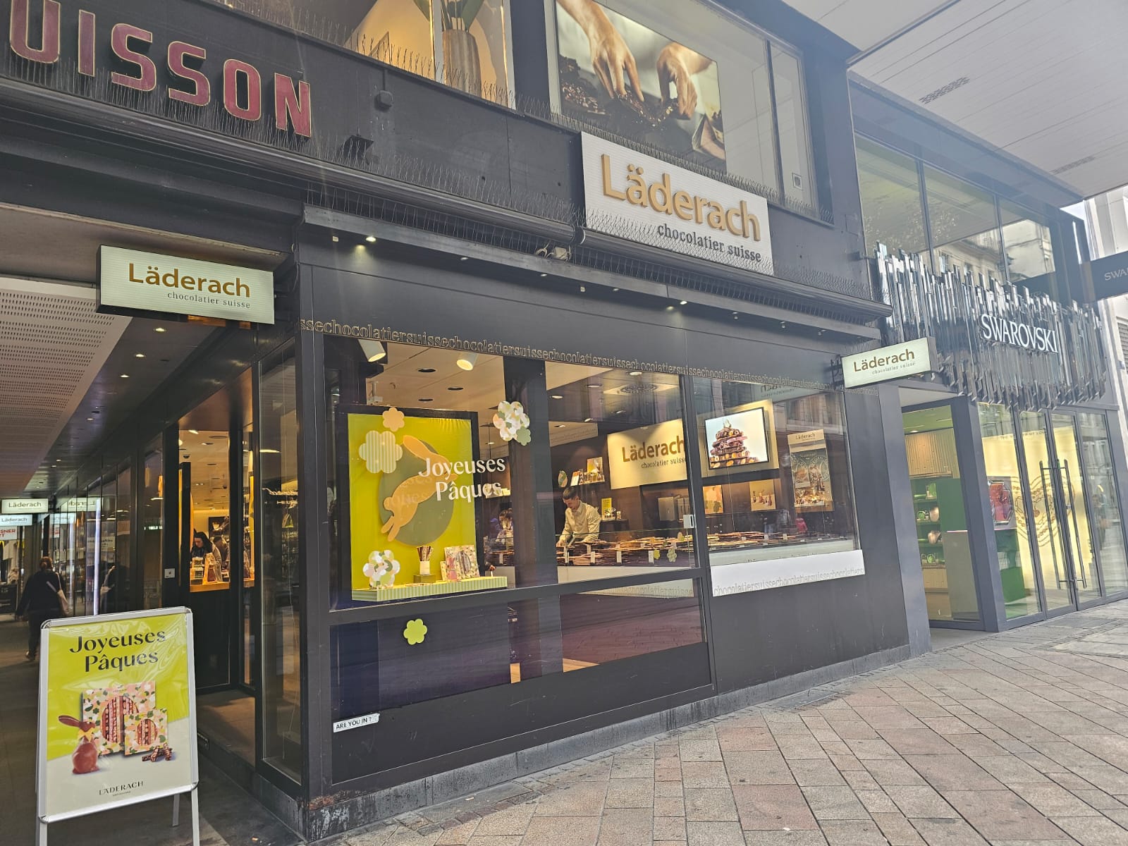
The third location, Läderäch was not easy to find because it was hidden among the buildings, at Rue du Mont-blanc 30, 1201 Geneva. When we entered the Läderäch chocolate shop, we were amazed with the design, as it was very captivating, yet reserved, giving it a wealthy atmosphere while keeping it interesting for the customer. There were chocolate sculptures, colorful chunks of chocolate bars and designed stands of a chocolate candy variety. It is a good place if you want to make a gift to someone and choose something sweet yet creative. For example, their petite boxes of chocolate popcorn with different flavors, or their gift boxes of minimalistic chocolate candies. There were no places where we could sit and drink coffee or rest, the shop was crowded, and the employees looked busy. We had to make a choice quickly and leave because the atmosphere wasn’t too comforting. When we tried to interview a staff member that wasn’t occupied with customers, she seemed to be not eager at all to answer any of our questions or interact. We had to stop our attempts because she looked clearly annoyed with our presence and we didn’t feel welcomed. As for the taste of the chocolate, it was moderately sweet with a clear taste of milk. The texture was crunchy at first and then creamy. The price was surprisingly lower than we thought, at 6 francs per bar, half as expensive as similar stores such as Martel, which added to the value.

 

Overall Ratings

Customer service: 3/10

Atmosphere: 5/10

Comfort: 2/10

Design:7/10

Taste: 8/10

Texture: 8/10 (crunchy then creamy)

Quality based on price: 9/10

Packaging: 10/10

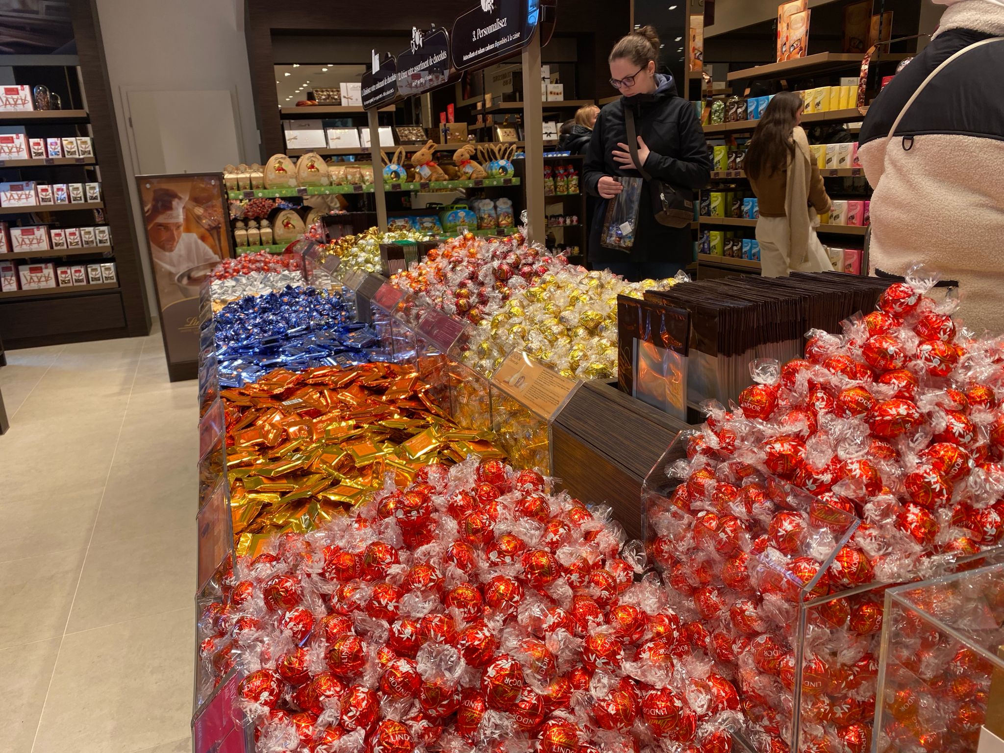
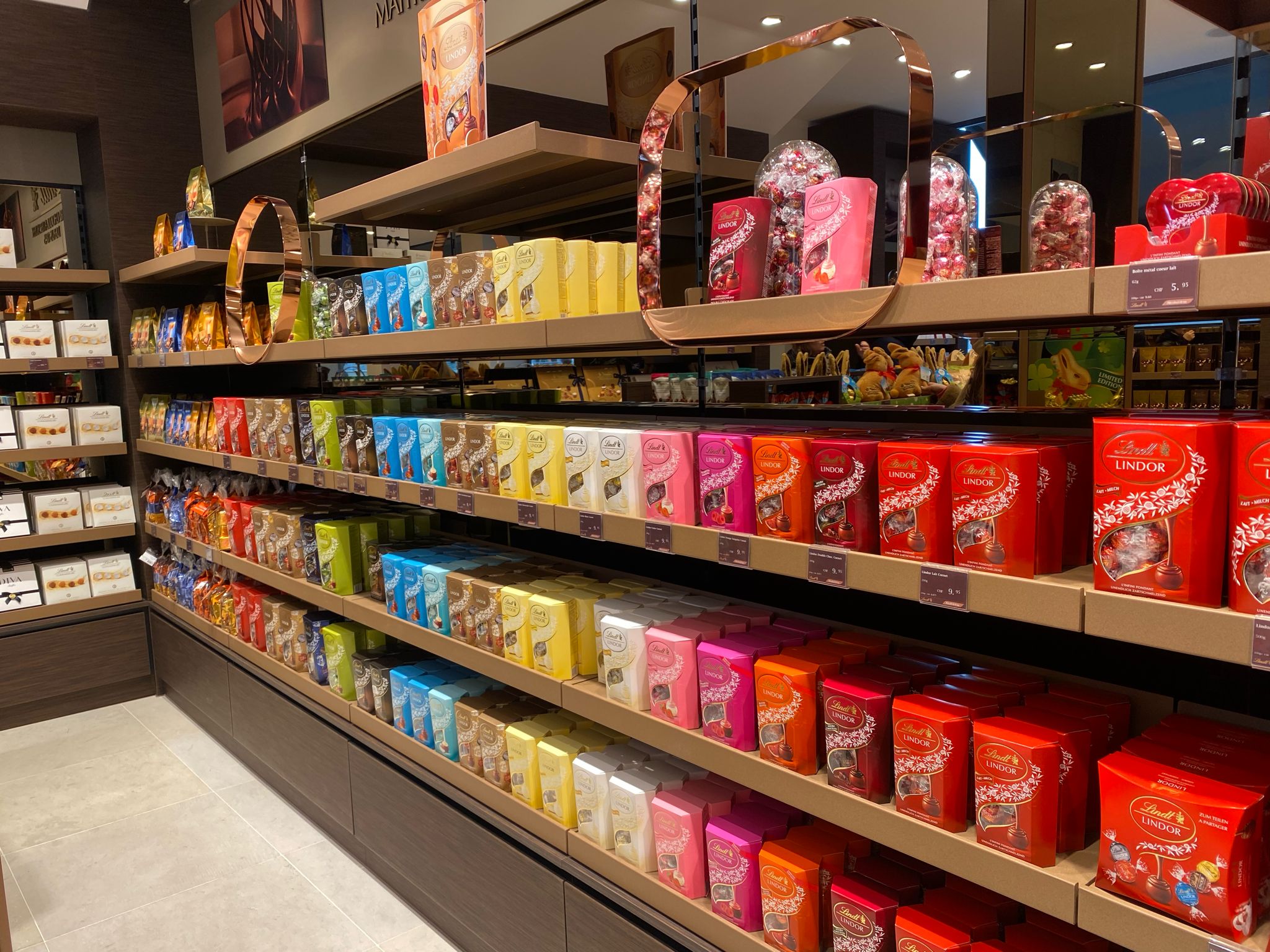
The last location we visited was Lindt at Rue de la Tour-de-L’île 1, 1204 Geneva. The store was easy to find, since it had a big colorful label and was not hidden by any shops or buildings. When we entered the shop, it seemed like a little museum because everything was very bright, colorful and designed in a way that attracted the most attention. There were big stands with rainbow coloured candy wrapped chocolates, brand themed toys, easter bunnies covered in gold wrapping, chocolate hearts and huge sculptures made of chocolate which was all very captivating. The store seemed to be great as a tourist attraction. Furthermore, it had a lot of choices: from raspberry flavored chocolates to coconut and dark chocolate flavors, valentine themed chocolates for couples, basic designs for average tourists and even funny little animal figurines for kids visitors. However, there was no place to sit, so we were expected to just buy chocolates and leave, which we were eager to do as there were quite a lot of people. As we were buying the chocolate, the staff members seemed friendly and polite. And as we left the store, buying a milk chocolate bar for a relatively low price, we were given 6 candies to try for free as a gift, which was very nice from the employee’s side.

As for the chocolate itself, it tasted quite good for the price of 2.50 which we paid. It was very sweet and milky, melting in the mouth, with some creamy aftertaste. However, it felt a little sticky and not as smooth when we chewed the chocolate.
Overall Ratings

Customer service: 8/10

Atmosphere: 7/10

Comfort: 2/10

Design: 9/10

Taste: 7/10

Texture: 6/10 (creamy but sticks on teeth)

Quality based on price: 8/10

Packaging: 2/10

Coop

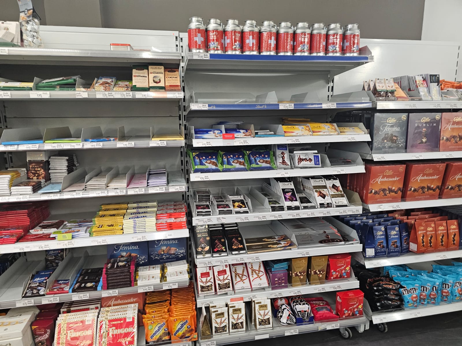
When we tried the coop’s vegan (oatmilk) chocolate bar, we were first excited to find out what this rather exotic chocolate is. But shortly after, we were hit with an atrocious taste that reminded us of grass mixed with sugar that also left a bad aftertaste and it felt ‘sticky’ in the mouth. The packaging was colorful and rather attractive, but the taste was very disappointing. The price was very cheap, similar to Lindt’s price but in terms of quality Lindt is marginally better.

Afterwards, we tried a regular milk chocolate bar from Coop for a relatively low price to cover the traumatic experience from the previous bar but it was almost just as bad, because it tasted too sugary with a hint of spoiled milk. The packaging was generic.

Overall Ratings

Vegan version: Taste: 0/10; Texture: 2/10; Quality based on price: 3/10; Packaging: 3/10

Regular: Taste: 3/10; Texture: 3/10; Quality based on price: 4/10; Packaging: 1/10
Conclusion

To sum up, our favorite store was Guillaume Bichet and our least favorite was Martel. However, in terms of chocolate we had different favorites. We found the Läderch chocolate the best tasting, while Coop had the worst tasting ones. Through this review we proved our thesis that price is not really the best indicator for the quality of products. To further test our thesis, we will conduct a blind taste testing of the chocolates we tried in class for our presentation.

Greece Trip 2023

Greece Trip 2023

We are pleased to showcase three student-produced videos, each offering a unique perspective, from a captivating visual poem to exquisite portraits capturing the essence of Greece. We hope you take delight in these presentations.

Title: “To Be Found In Greece”

By: Angel Gutierrez

Presenting a visual poem with content captured during her study trip with Webster University Geneva in Greece.

Title: “Learning in Greece”

By: Sarah Fresard

Presenting a video based in Greece showcasing different parts of the study trip while exploring a variety of cities.

Title: “Webster University Geneva Greece Trip, 2023″

By: Antonella Borjas

A stunning portrayal of Greece complemented by enchanting bouzouki melodies.


Greece Media Trip, 2023

Greece Media Trip, 2023

The Media Communications department of Webster University in Geneva has launched courses which include a field trip experience since 2007.
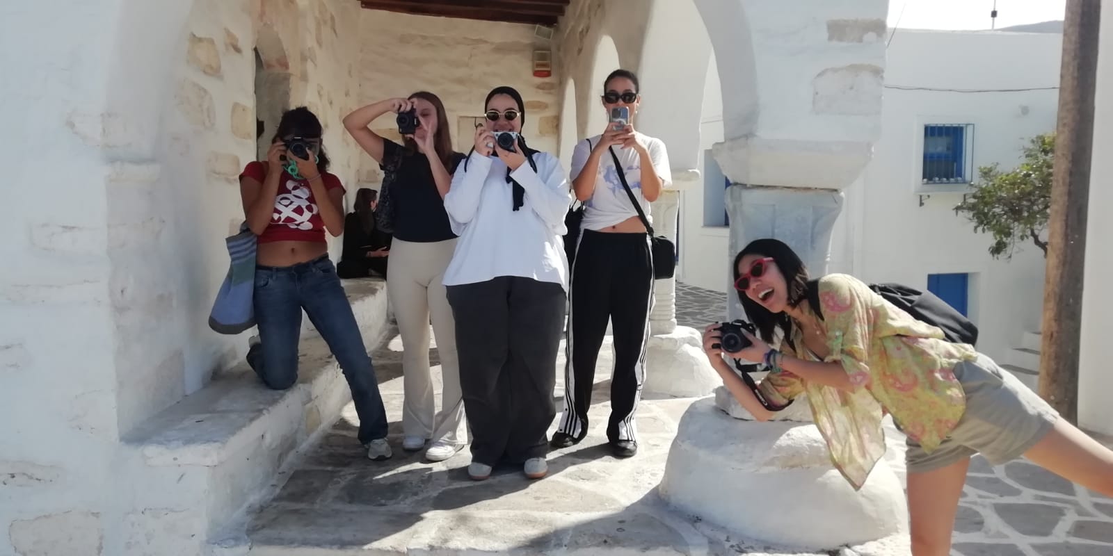
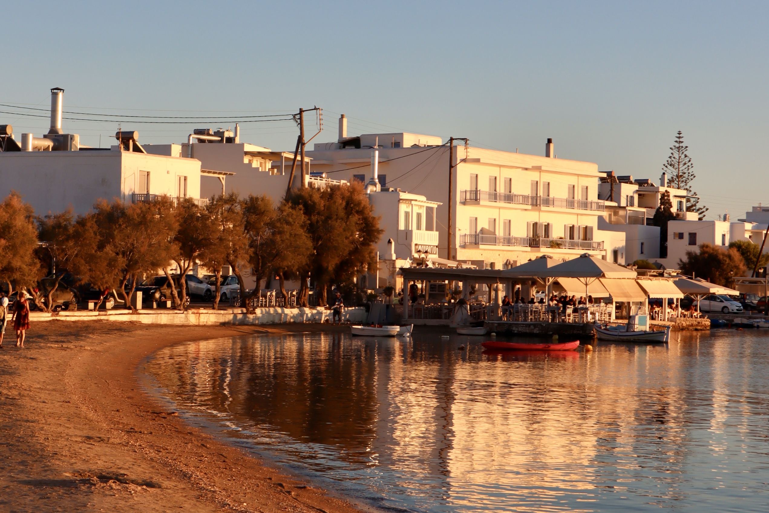
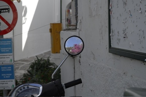
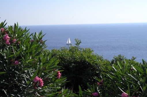
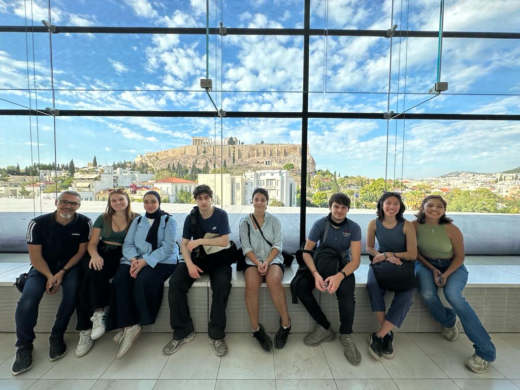
In collaboration with the Webster campus in Athens, the two courses PHOT 3150 Topics in Photography and DESN 1210 Concepts of Design brought students to Athens and the Cycladic island of Paros. The aim of this experience abroad was to expose them to the production of media in the field while living in a different cultural context. Being the cradle of Western culture, Greece was the perfect environment for this purpose. Students were led by the professor through the basic elements of design and composition. They were challenged to understand the connections with contemporary creativity and innovation in the fields of media production.

Webster University in Geneva Media Greece Trip, held in October 2023, was a life-changing experience for the students of PHOT 3150 and DESN 1210. Beginning in the ancient city of Athens, the journey opened doors to a world of history and culture.

Sarah Fresard
Greta Sigona

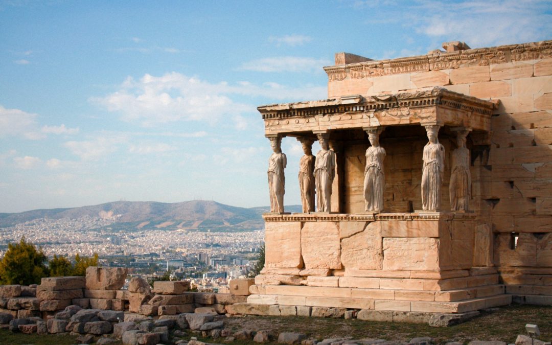
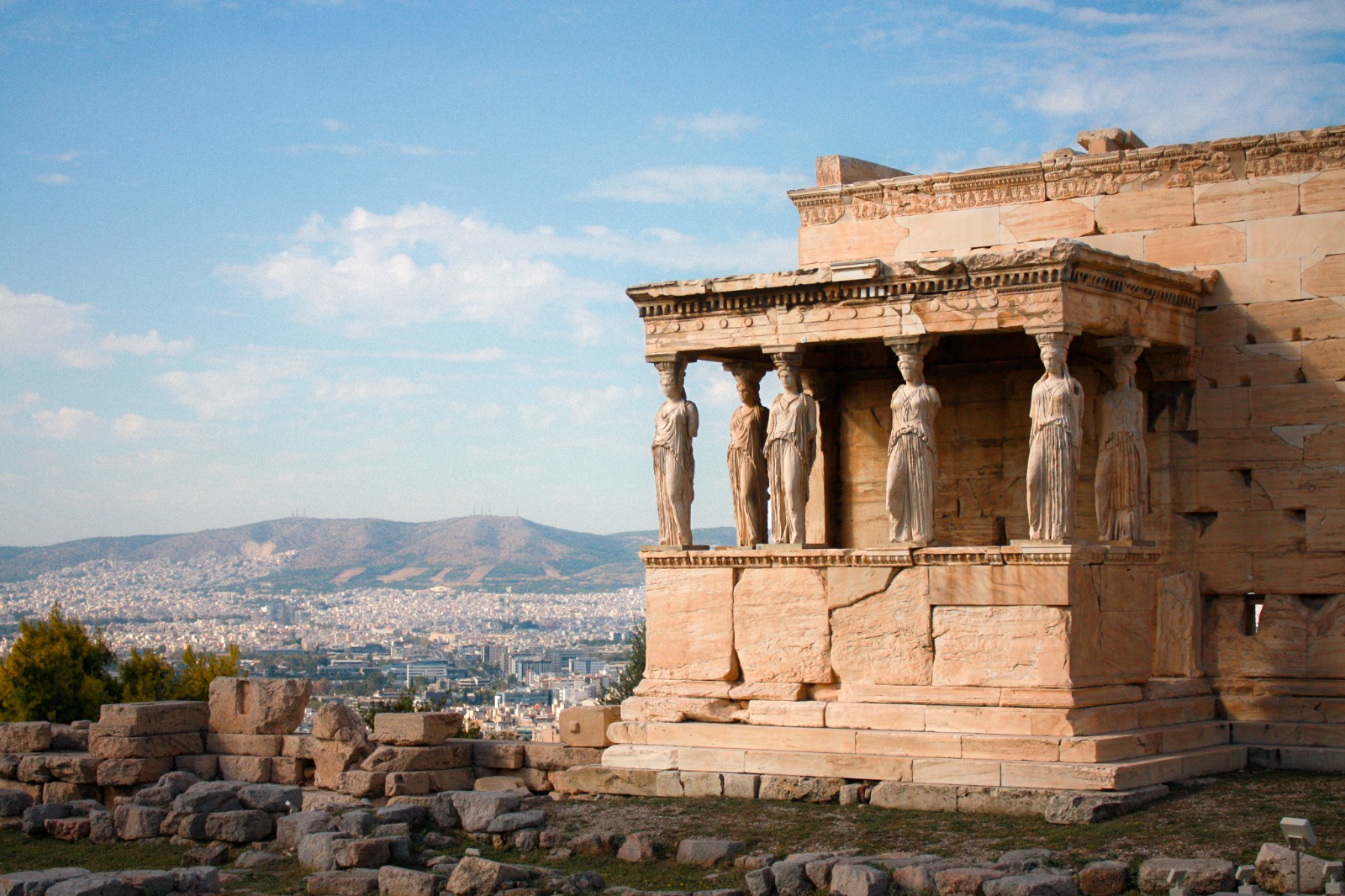
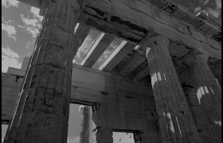
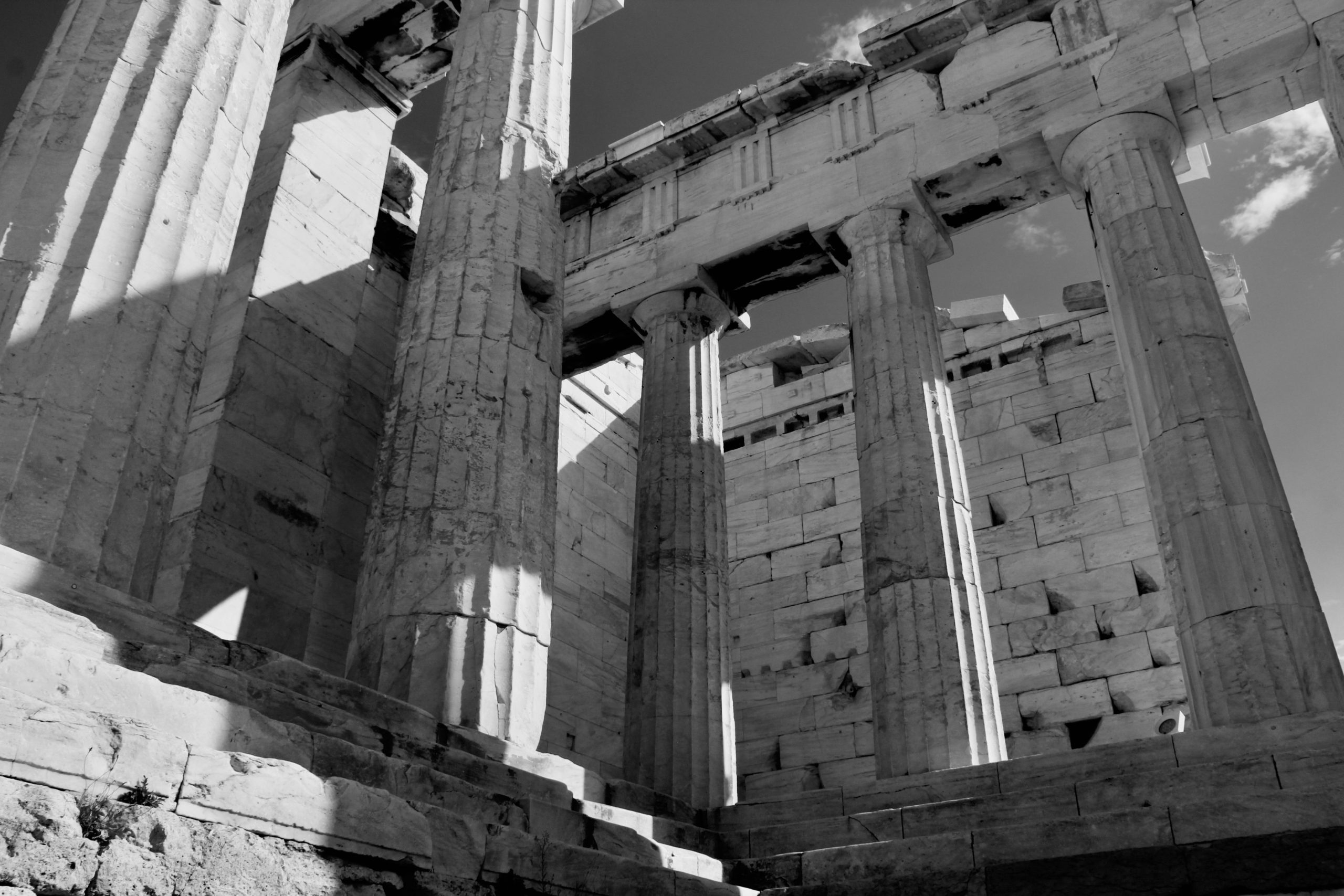
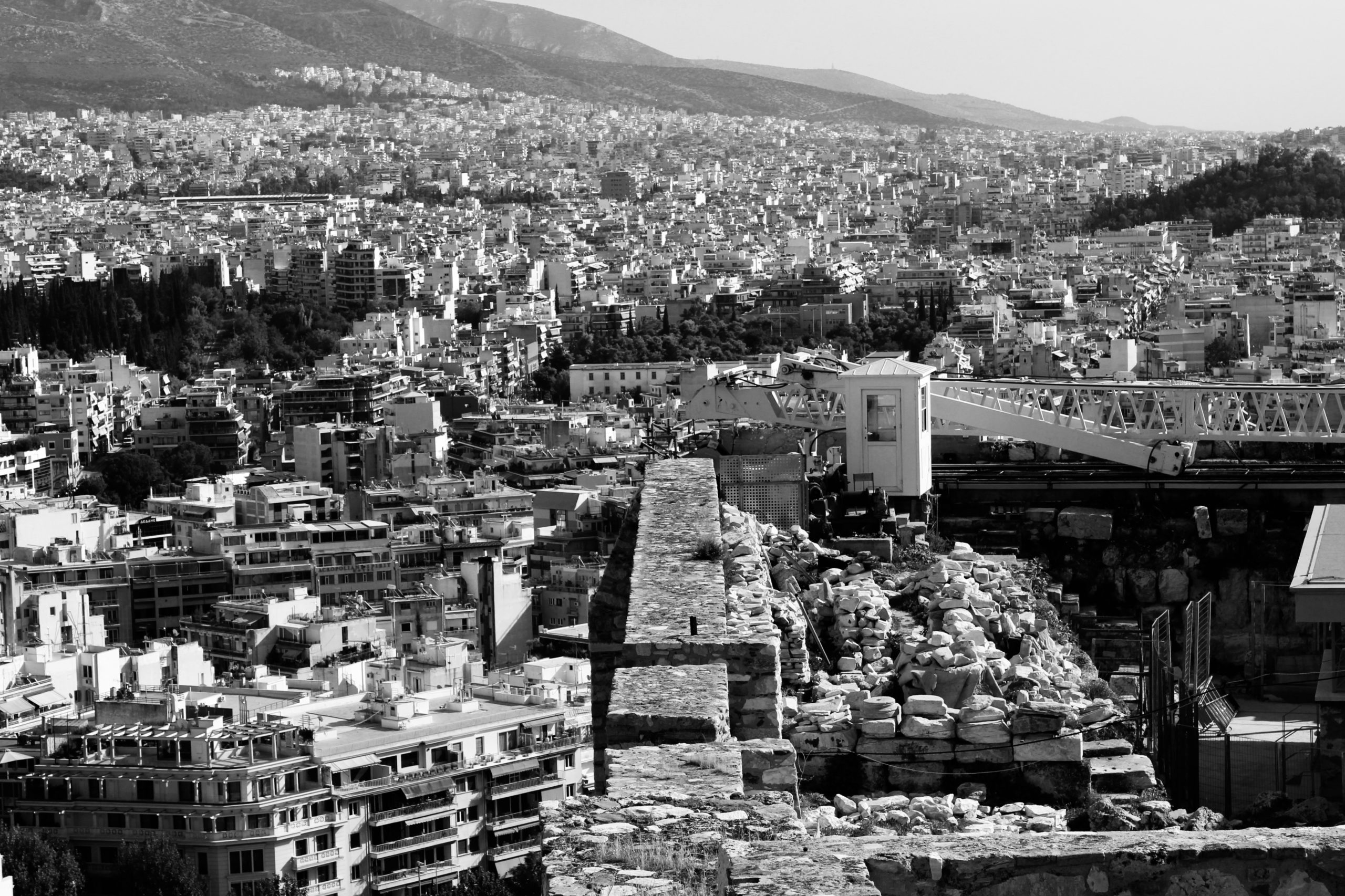
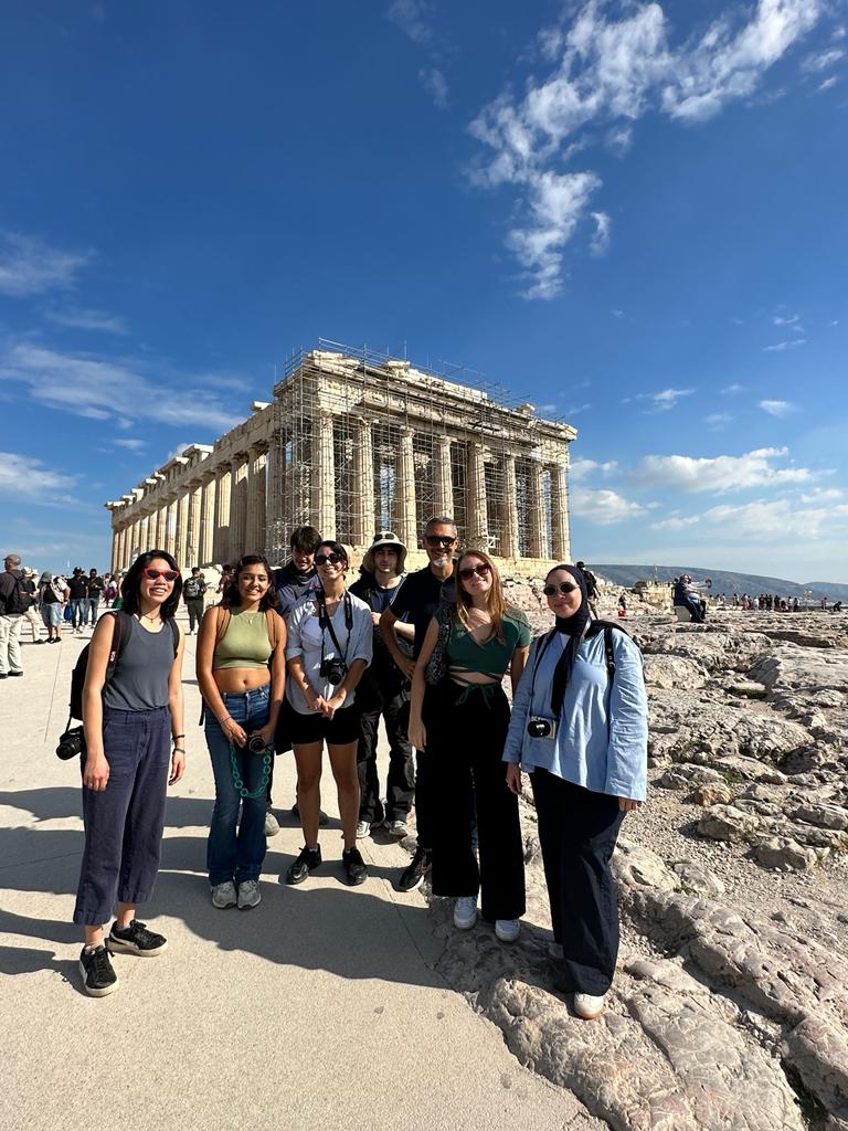
Their adventure began among the ancient ruins and streets of Athens. All equipped with cameras, they explored the city by foot, discovering iconic sites such as the legendary Acropolis and its museum, and the treasures housed within the National Archaeological Museum. Every step through the little town of Anafiotika provided another view into ancient Greece. One of the highlights of their time in Athens was a day trip to Cape Sounion, where the Temple of Poseidon formerly stood as a symbol of hope as it marked the end of several sea expeditions.

Giulio Giannicchi

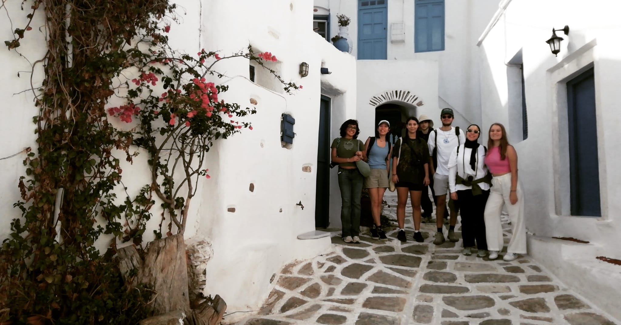
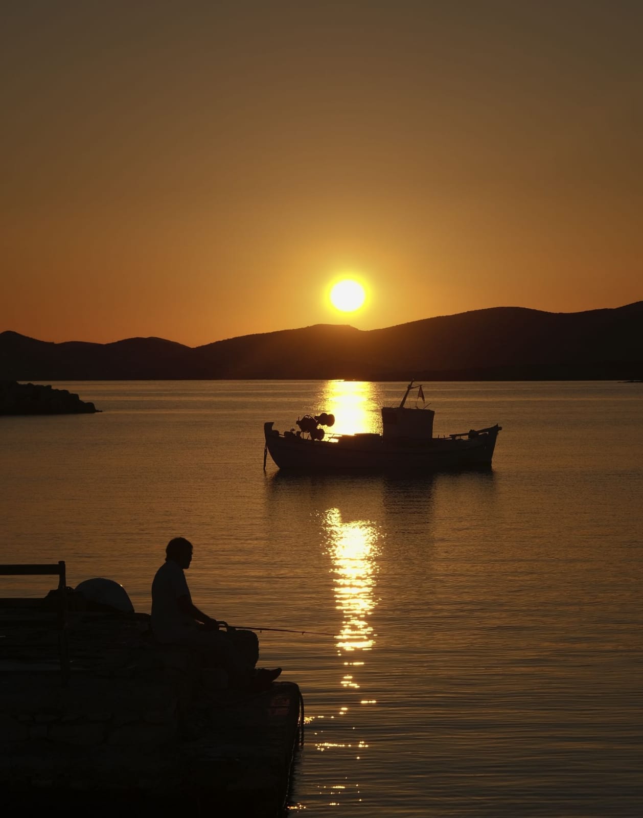
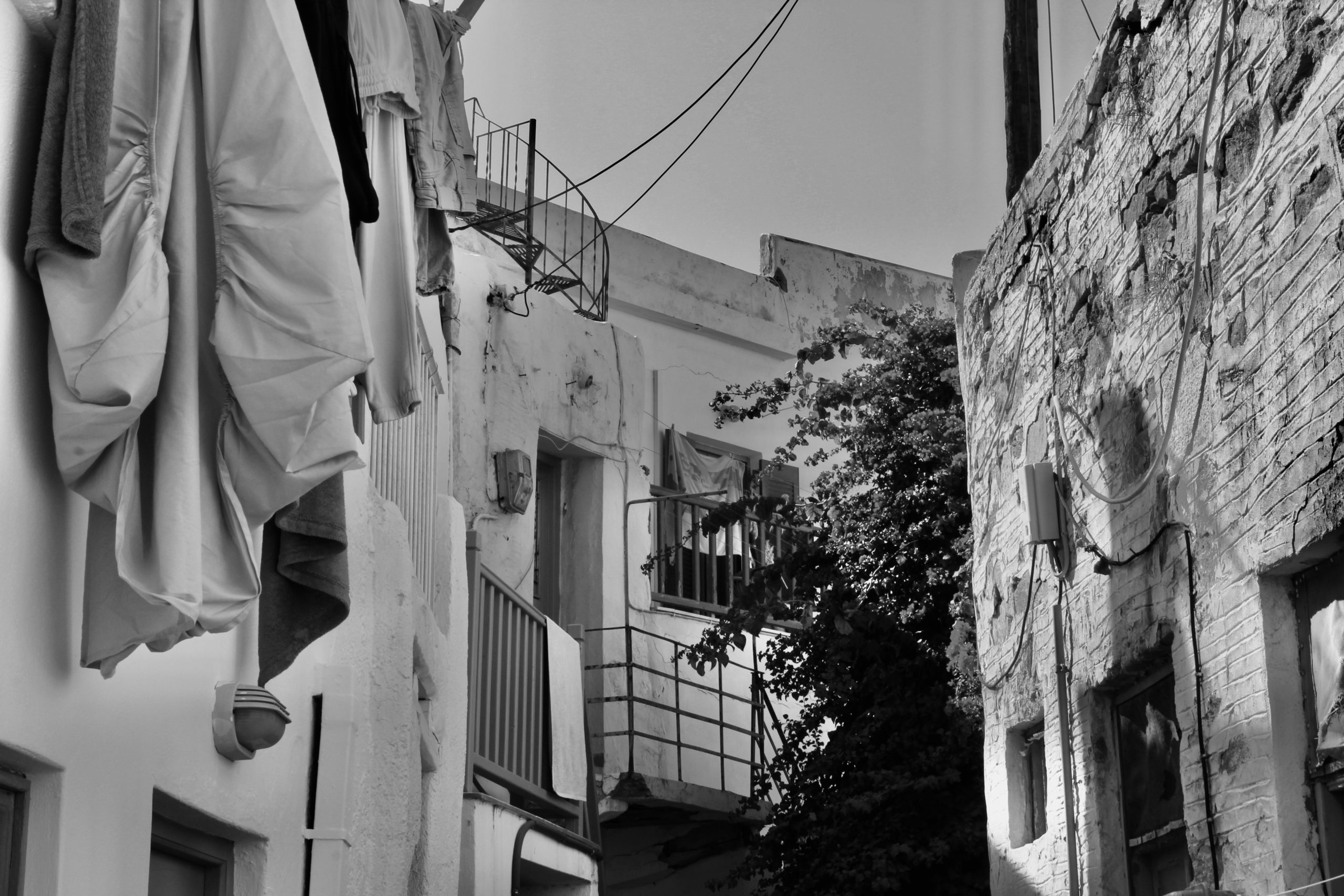
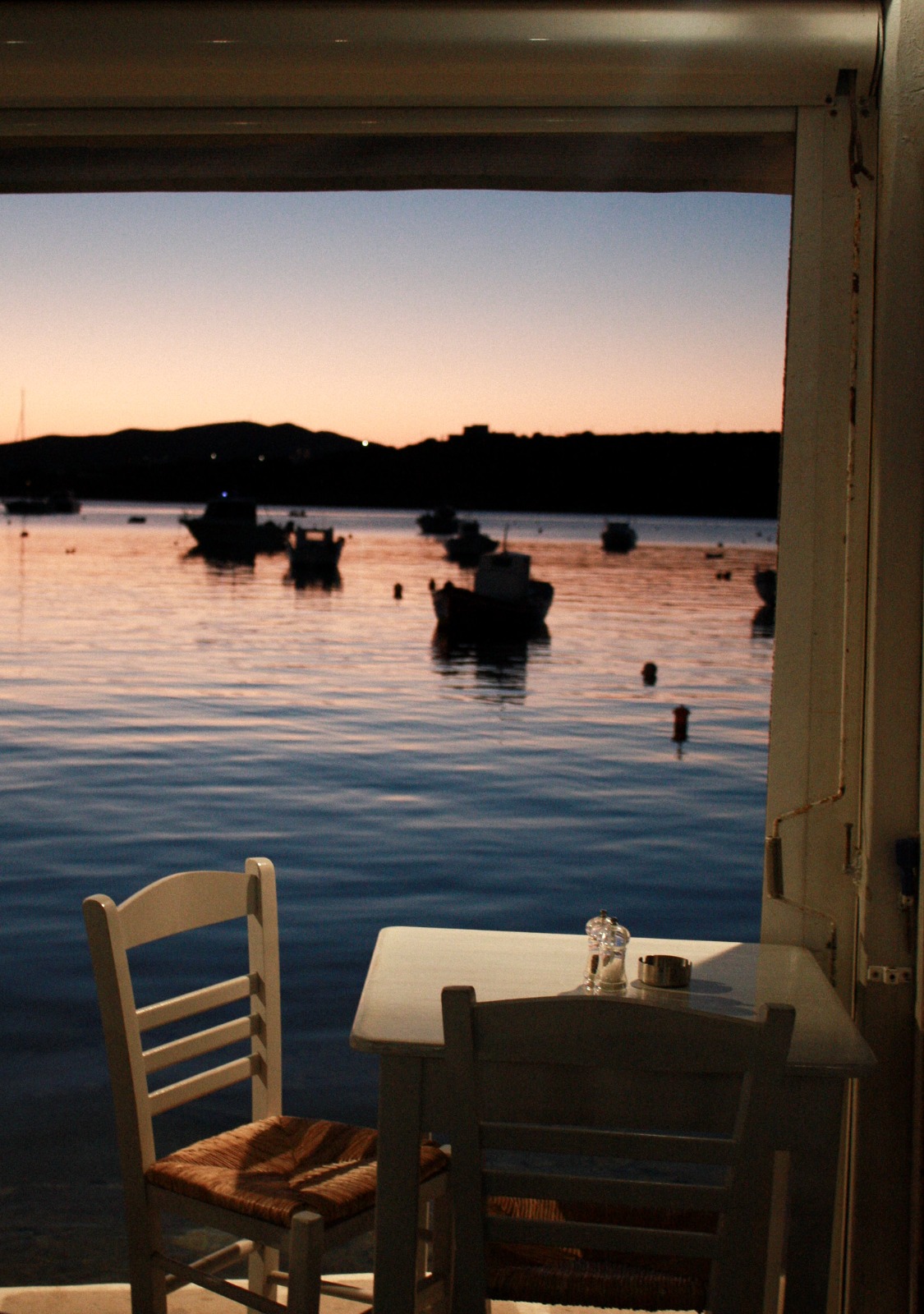
Leaving Athens behind, they set sail for Paros, a captivating island in the heart of the Aegean Sea, with the ferry trip which started with a breathtaking sunrise. They stayed in the charming Cycladic village of Parikia.

Tamara Daher
Sarah Fresard

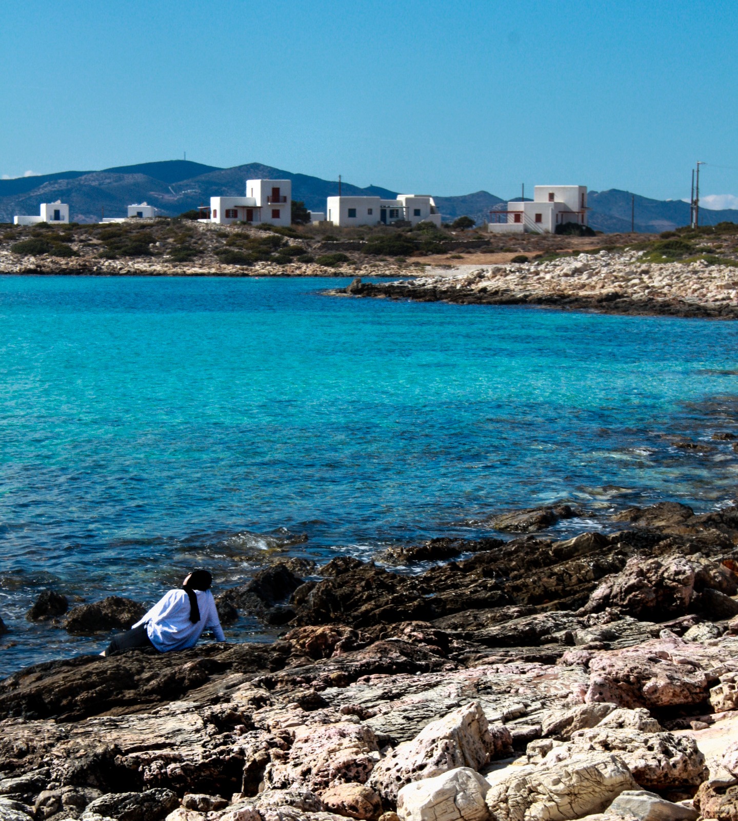
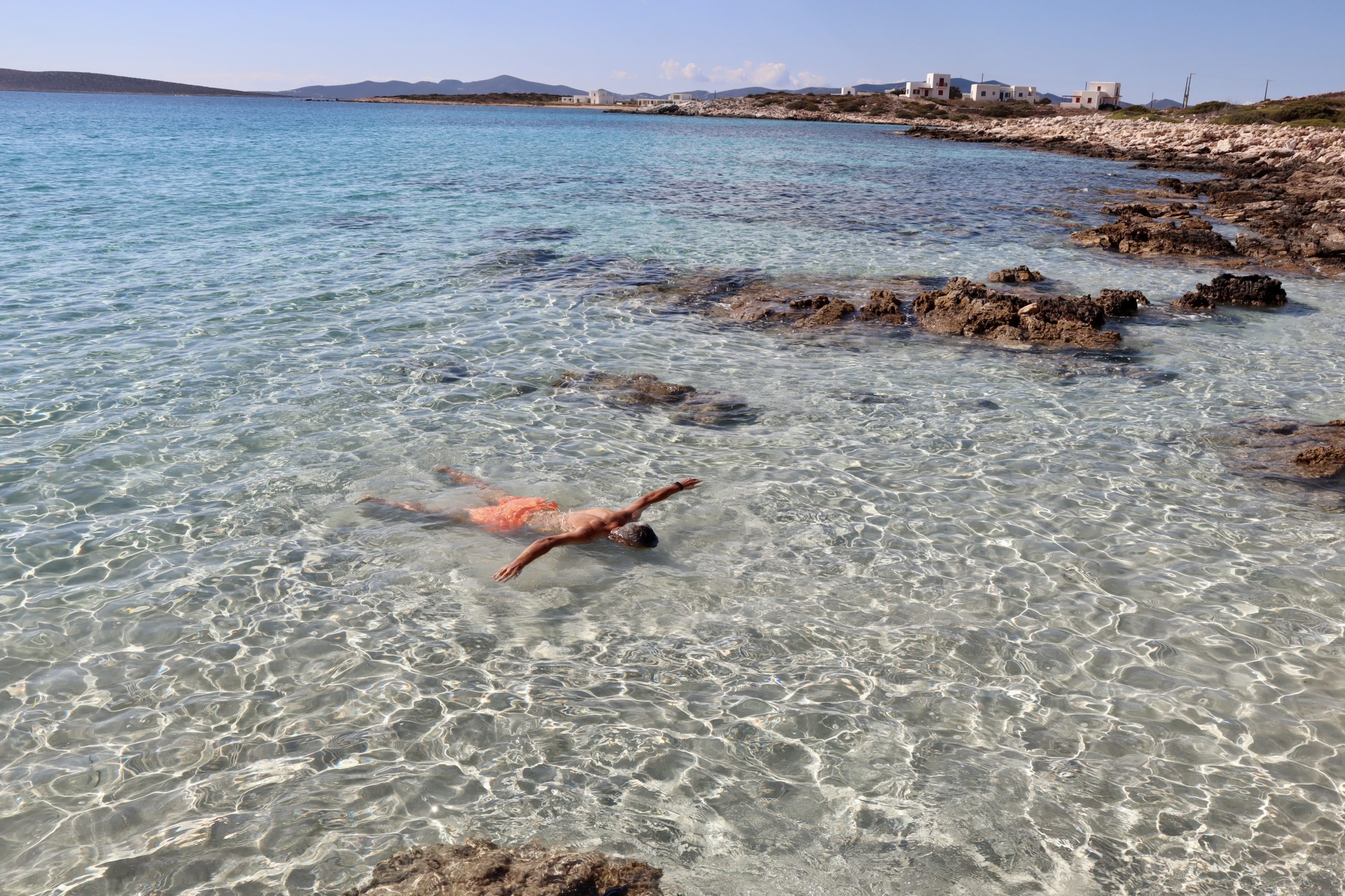
As the students explored three magnificent beaches in Paros, they were captivated by the island’s clear waters and white sand.
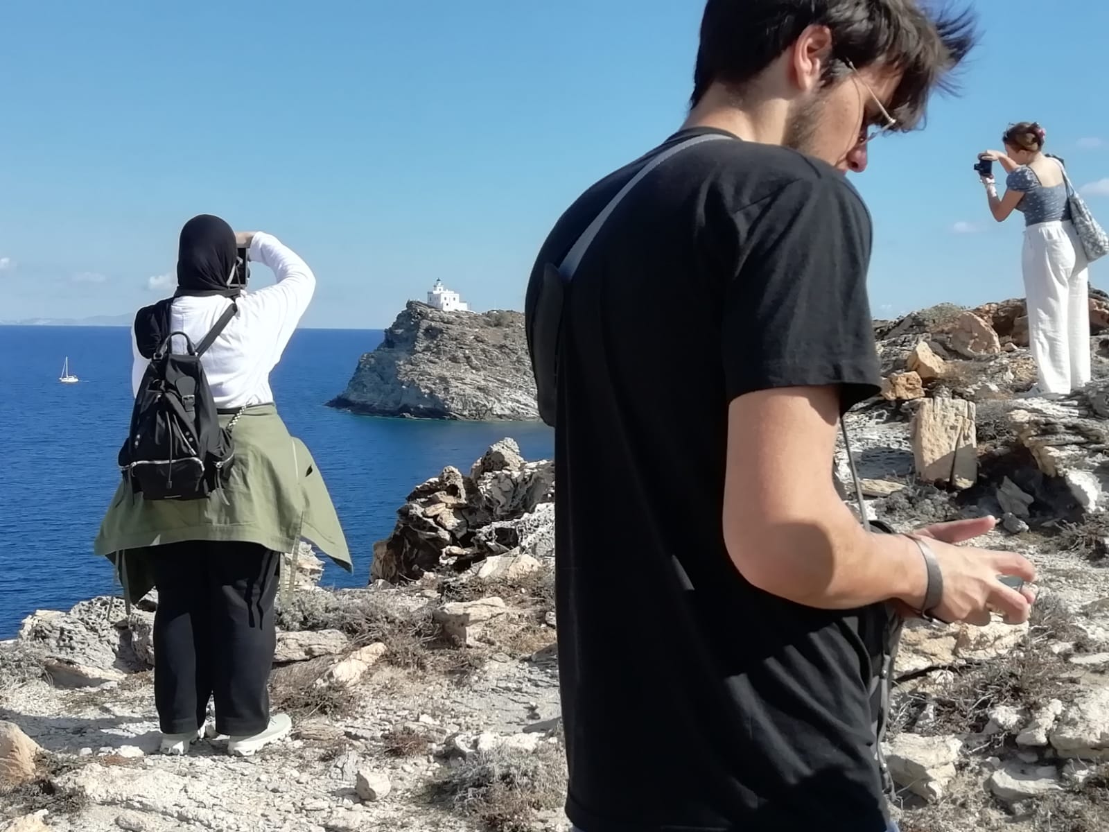
Hikes allowed them to discover even more places, the first one was from Lefkes to Prodromos, where they were welcomed in the town’s local restaurant. They went on another hike to get to the lighthouse, where they had a packed lunch while taking in the view of the ocean and the island’s coastline.

Angel Gutierrez
Angel Gutierrez
Giulio Giannicchi

They had the unique opportunity of being invited to the Paros Photo Club’s weekly meeting. Here the students were able to share their photographic work and make connections with local artists.

Antonella Borjas

Students were able to well immerse themselves in the spirit of the historical ruins and small towns in Paros due to the timing in their trip, which allowed them to enjoy the beauty of the different locations visited at a much less busy season.

Tamara Daher
Sarah Fresard

The students left their wonderful journey with lots of memories and some of their best photographs that told the story of their Greek trip.

Greta Sigona
Angel Gutierrez
Antonella Borjas
Art Gallery Review

Art Gallery Review

Art Gallery Review

By …

Introduction:

The contemporary art scene is an exciting and dynamic space that is constantly pushing the boundaries of traditional art forms. To experience some of the most thought-provoking and innovative contemporary art being produced today, we have chosen to visit five different galleries – Artion, Nebulus, MENO, Bailly, and Gowen. Each of these galleries showcases modern and cutting-edge art from emerging and established artists. As a bonus, these galleries offer free admission to students, making it an accessible and enjoyable leisure activity for art enthusiasts and novices alike.

Some of the different criteria that we used to judge each gallery was: We considered the objective of each exhibition (the Theme), number of works, space of the environment, location, and the people we believe it attracts which also related to over personal conclusion of each gallery

Artion Gallery

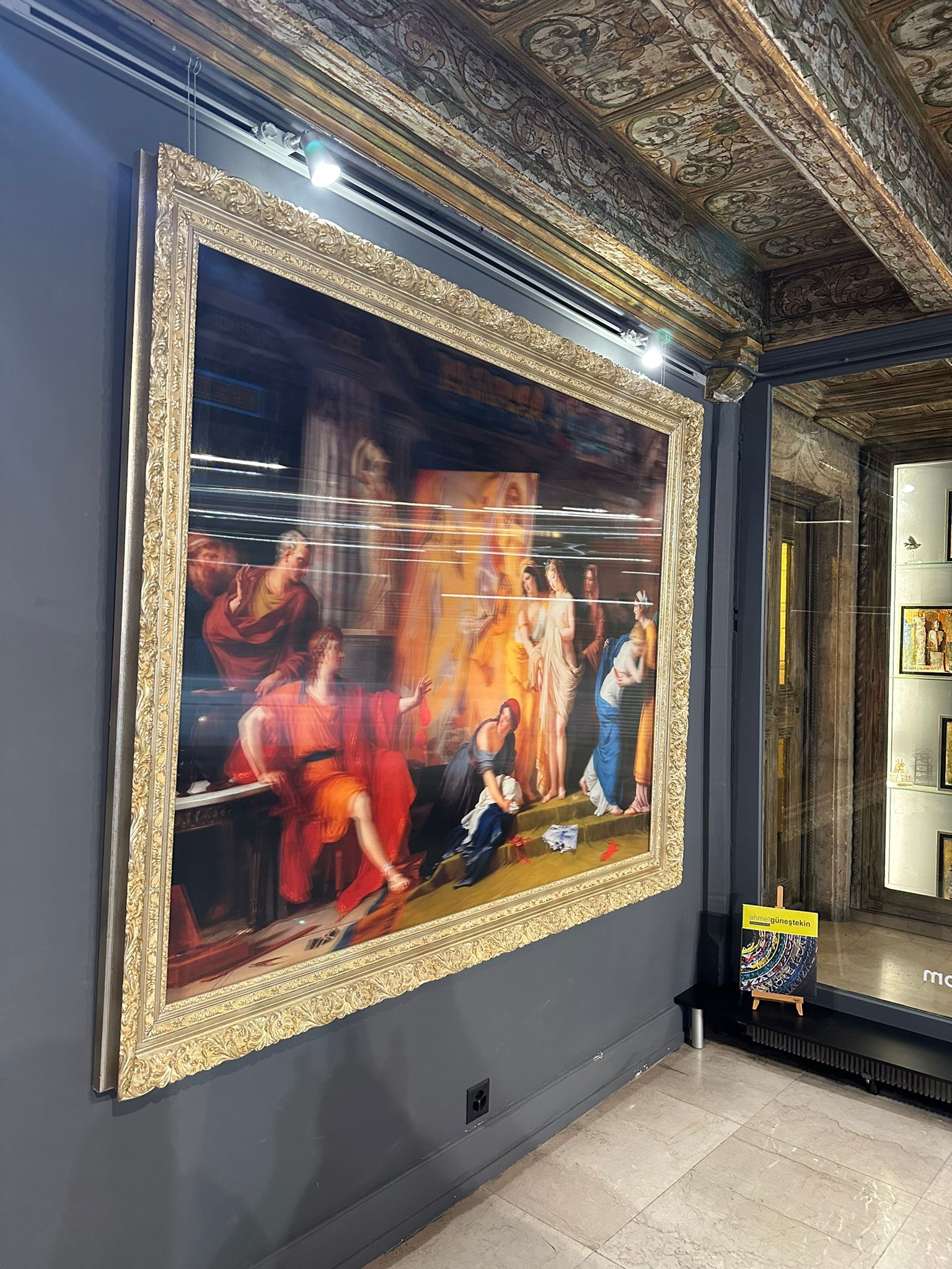
Objective: “Our passion for the living history of art, as well as our desire to protect the memory and quality of the Old Masters, in alignment with contemporary trends, result in a dynamic synthesis of the artists we represent; the synergies of their work create orientations, shape opinions and one could argue contribute to the general evolution of the art world, transforming the Commercial Spectrum into Art Historical Context.”

People it would attract: Although the gallery is open to everyone, from what is presented, we assumed that people who have at least a basic understanding of art or an affinity for classical art would enjoy the exhibition more as they can draw links to the original artwork being transformed.

Number of works: 30

Space: The area itself was quite dark itself with two distinguishable floors that required some exploring inorder to fully immerse into the exhibition.

Location: 34 Grand-Rue 204, Geneva

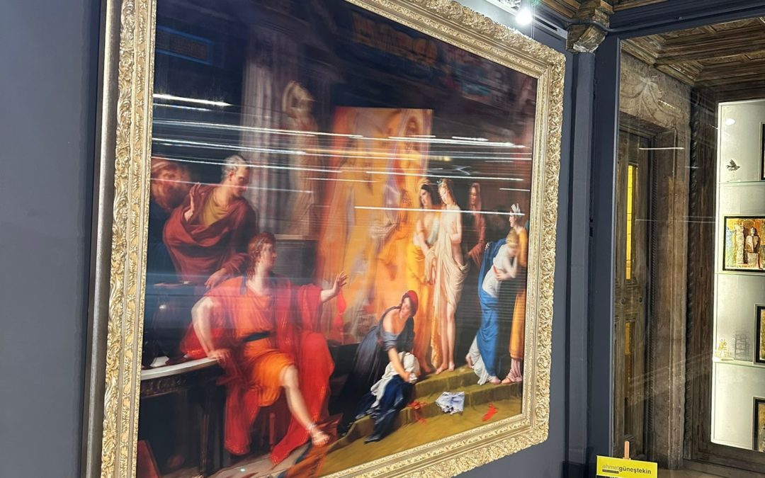
Conclusion: This was one of the first galleries we saw, and we were thoroughly impressed. The art itself was quite immersive because it subverted the ‘great’ art we’ve grown up adorning. The birth of Venus was turned into a mosaic and the painting of the last supper was remodeled in a 3D way to depict two different scenes based on where you saw it. It’s a gallery worth seeing with a dark and moody interior.

Nebulous Pace Gallery

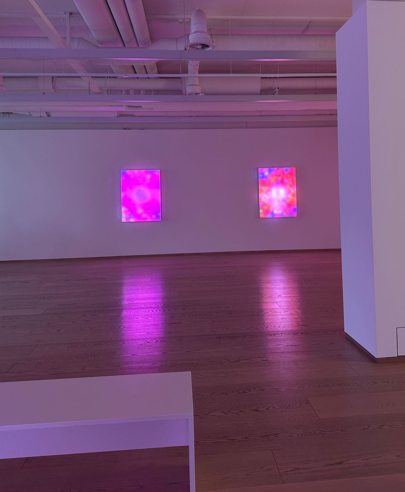
Objective of the installation: “Rooted in the art historical language of abstraction, Villareal’s practice uses pixels and binary code to create complex, rhythmic compositions. Investigating the capacity of light and code as both medium and subject, Villareal’s practice is concerned with the immersive, experiential, and sensorial qualities of perception.

Villareal’s latest body of work, titled Nebulae, brings this language of brightly coloured LED lights, electronics, and custom coding into the gallery space. These new wall-based sculptures are composed of hypnotic, diffused light that pulsates in vibrant hues of radiant colors. Drawing simultaneously on organic, celestial imagery and the visual lexicon of custom software, Villareal’s work bridges the divide, inviting viewers to engage with the boundary that separates the physical and digital worlds.”

People it would attract: Due to its subliminal atmosphere and the eye-catching twinkling of the light, we stated that this atmosphere would be perfect for people who want to fully immerse themselves into a body of work for a short time. Whether that be kids, students, or lawyers, there is something here that grips at everyone’s attention.

Number of works: 8

Space: The space of the gallery itself was very spacious, thus it was on theme with the exhibition as well. The open area allows the audience to fully immerse themselves in the work. Very ethereal and light.

Location: Quai des Bergues 15-17, Geneva

Conclusion: This exhibition, (in my opinion), was the second best of the galleries we explored. It was very spacious and light because the space was open for the viewer to explore it in whichever way they pleased. With 8 major works, each with its own theme and color palette, the art gallery really transported the viewer into another world. I personally recommend this to anyone wishing to try something new in Geneva – whilst it’s still here.

Gowen Art Gallery

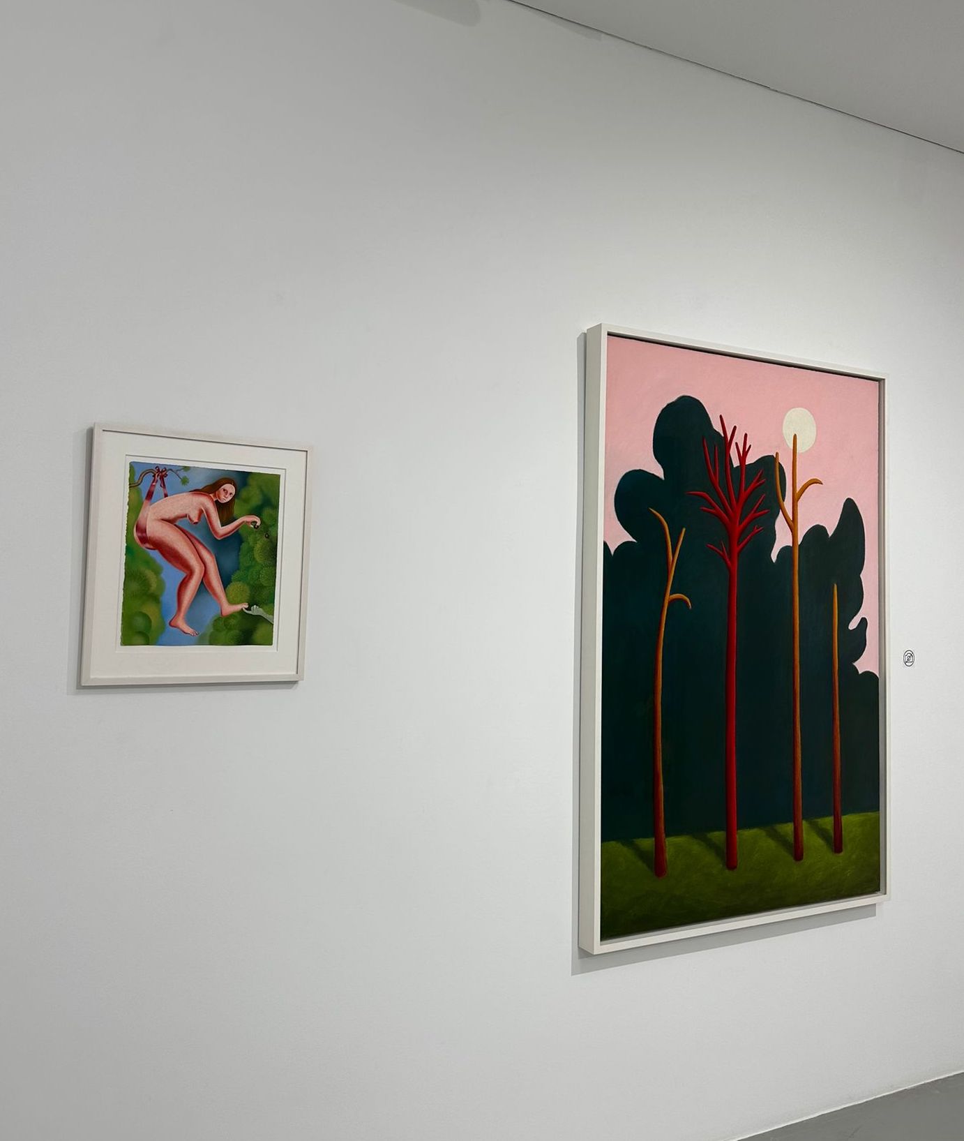
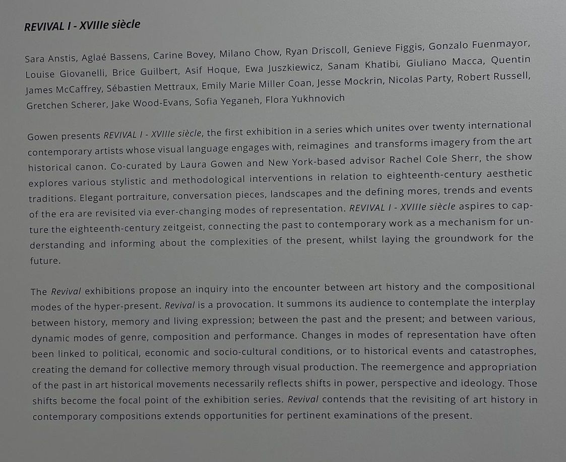
Objective of the installation: “Gowen presents REVIVAL I – XVIIIe siècle, the first exhibition in a series which unites over twenty international contemporary artists whose visual language engages with, reimagines, and transforms imagery from the art historical canon. Co-curated by Laura Gowen and New York-based advisor Rachel Cole, the show explores various stylistic and methodological interventions in relation to eighteenth-century aesthetic traditions. Elegant portraiture, conversation pieces, landscapes and the defining mores, trends and events of the era are revisited via ever-changing modes of representation. REVIVAL I – XVIIIe siècle aspires to capture the eighteenth-century zeitgeist, connecting the past to contemporary work as a

mechanism for understanding and informing about the complexities of the present, whilst laying the groundwork for the future.”

People it would attract: The installation that was shown during the time that we visited was also playing with our modern understanding of the Renaissance, just like the Artion Gallery. It was very modern and polished. We believe that people who have an interest in modern art, and who can afford to pay big money for it, would be the ideal audience. Students who enjoy small luxuries would also really enjoy this. This exhibition was done with a younger audience in mind, since the artists themselves were using social media to elevate their works of art and build a community.

Number of works: 27
Location: Grand-Rue 23, 1204 Genève

Space: With many twists and turns all about the gallery, I liked the ‘personal’ journey that the viewer got to embark on. The works were perfected spaced out and the interior allocated enough time and space for the viewer to come to their own conclusions before jumping to the next work.

Conclusion: the interior of the gallery was quite minimalistic with a lot of corners and turns. It encouraged the viewer to take matters into their own hands and seek something that stands out to them. All the works were very thought provoking and the art curator was extremely talented and proficient in his work which helped better understand the purpose of the exhibition.

Interview

How often do you change the artworks in the gallery?

It depends on the exhibition, but we usually change them every four to five months. For example, this exhibition is going to last until the end of April, so we are going to change the paintings when the exhibition ends.

What kinds of artists take part in the exhibitions that are held at your gallery?

There are many artists that mainly create contemporary art and most of them are young, about 30-50 years old. WIth this specific collection we integrated the use of social media as most of the artists featured have used their platforms to elevate their status and their works. The reception of the works has been very positive.

How does your gallery have so many clients and visitors that want to see the exhibitions and maybe buy some pieces?
That is also related to the second question because I think one of the main reasons our gallery is so famous is social media. Our artists are mostly young and they share their art with the world through social media which connects them to young clients who come and visit our gallery daily.

Bailly’s Art Gallery

Objective of the installation: “There is an infinite number of subjects, techniques, artistic visions and creative processes that lead to the creation of a work of art. Yet, there are times when compositions that appear to be fundamentally different from one another hold common characteristics: the presence of lines and shades of color. The exhibition Lines and Colors: An artistic path provides a grouping of works that exposes the multitude of unique creative paths resulting from the use of lines and colors”

People it would attract: From all the galleries we visited, this felt the most ‘archaic’ because we didn’t find it soul grabbing or eye catching. From this agreement, we believe that people over the age of 35 may be more prone to enjoy the finer details that we happened to overlook.

M.E.N.O Art Gallery


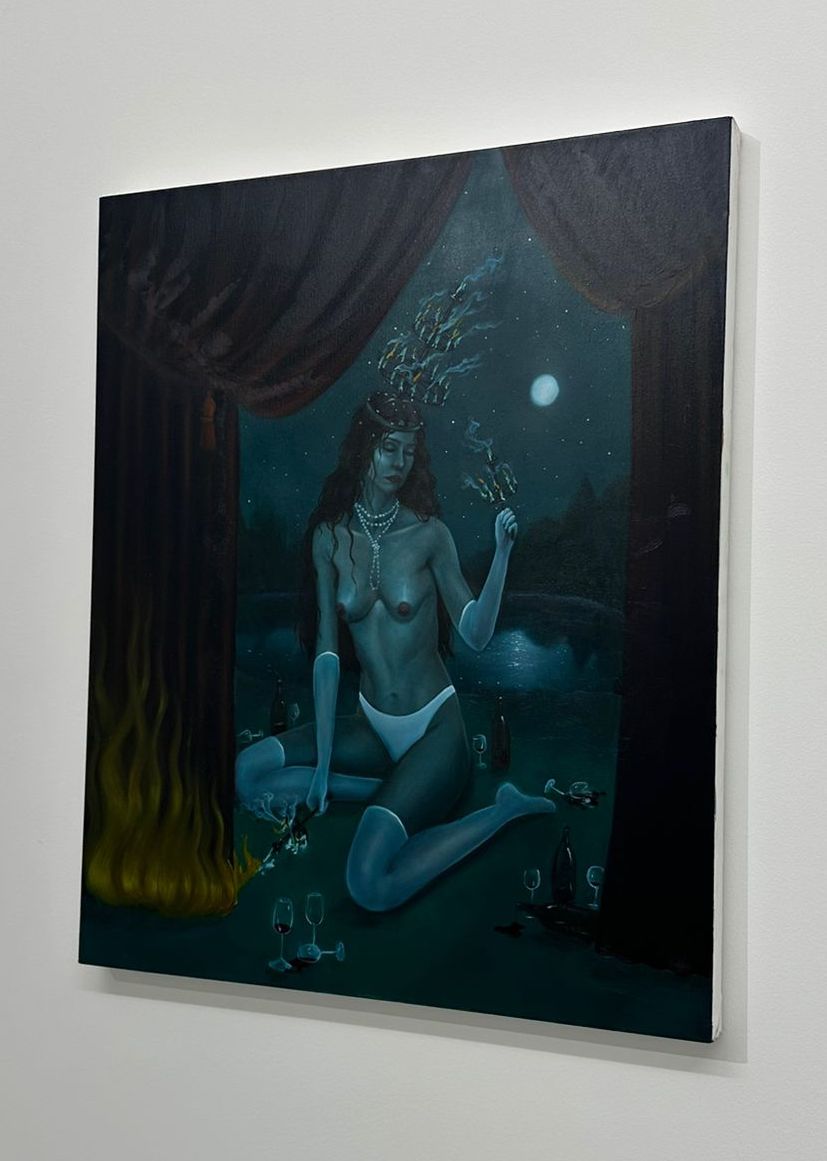
Objective of the installation: “With a different tangible delineation from the previous galleries, M.E.N.O focuses on creating an atmosphere of fun and spontaneity where the abstract linear works are displayed in an attempt to attract the viewer’s raw reactions.”

People it would attract: This installation showcased a very ‘typical’ abstract gallery atmosphere, where linear lines are composed in a delicate way to elicit a reaction from the viewer. The location of the museum makes it easy for students to hop from one gallery to another. Although we would encourage people who find modern art ‘boring’ to give this one a try, if they’re willing to go with an open mind.

Number of works: 27
Location: Grand-Rue 33, 1204 Genève

Space: the work is comparable to the Gowen with a higher frequency of works per wall/ room. The clean aesthetic of all the white walls carried on in the showroom which helped transmit the true colors and emotions of each artwork.

Conclusion: By the end of the tour I believe that the viewers had formulated their own perspective on what the works were supposed to emoting. I believe the end purpose of the gallery is to trigger a more introspective reflection of what it means to be in such an abstract setting, thus it was quite worth the view.

However, this is an experience that we’d encourage all students and others to try because it offered a lot of different perspectives on a large selection of artworks.

Number of works: 20+

Space: Moderate spacing in the gallery with enough spacing and enough area but they could have done a bit more with the deco and the immersion of the theme with their artwork.

Location: Rue de l’Hôtel-de-Ville 10, 1204 Genève

Conclusion: The artworks displayed follow inline with the contemporary theme we’ve seen thus far with a post- modern twist. What really caught our attention was the fact that there were a lot of sculptures integrated into the exhibition. The works were all quite different from each other but I think it helped break the monotony of the 4 previous galleries. Although there is a lot to explore, the previous galleries piqued our interest, however we’d love for the students to see and decide for themselves!

Tuscany 2023, Journey Vlog

Tuscany 2023, Journey Vlog

Webster University Geneva offers a yearly outing to Tuscany directed by the Head of the Department Francesco Arese Visconti.

This year, one of the students of the group called Giulio Giannicchi documented the seven-hour car ride to Tuscany.

We hope you enjoy the video!

Tuscany Trip Spring 2022

Tuscany Trip Spring 2022

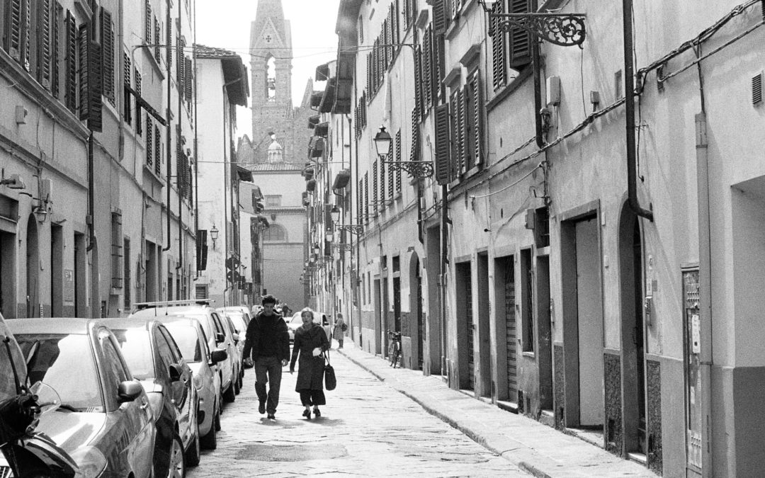
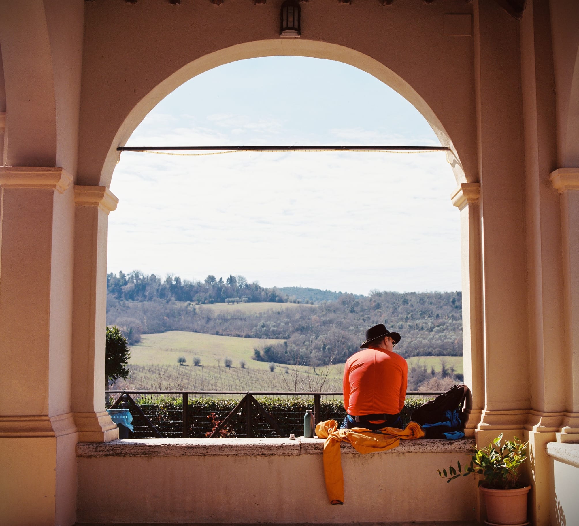
When you hear about a Tuscany trip you might be thinking about beautiful sceneries decorated by cypresses and olive trees, great food, nice weather… Let me reassure you, it is all of that, but more. It is also, and most importantly, about meeting new people and learning about media production in a beautiful environment.

The Geneva Webster university’s media department used to organize the Tuscany trip annually during spring break, however because of the pandemic the last trip to Tuscany was back in 2019. The silver lining in all of this is that this long postponement made this year’s trip that much more exciting. Though the trip is a course and we do learn a whole lot, it feels more like a productive and educational vacation.

This year three courses were offered: EPMD1000, PHOTO4000, And FTVP3150. EPMD1000 is an introductory media production course taught by Professor Ariese Visconti. It covers the essentials for creating successful audiovisual media. The students have to produce things such as a podcast, photos, and videos.


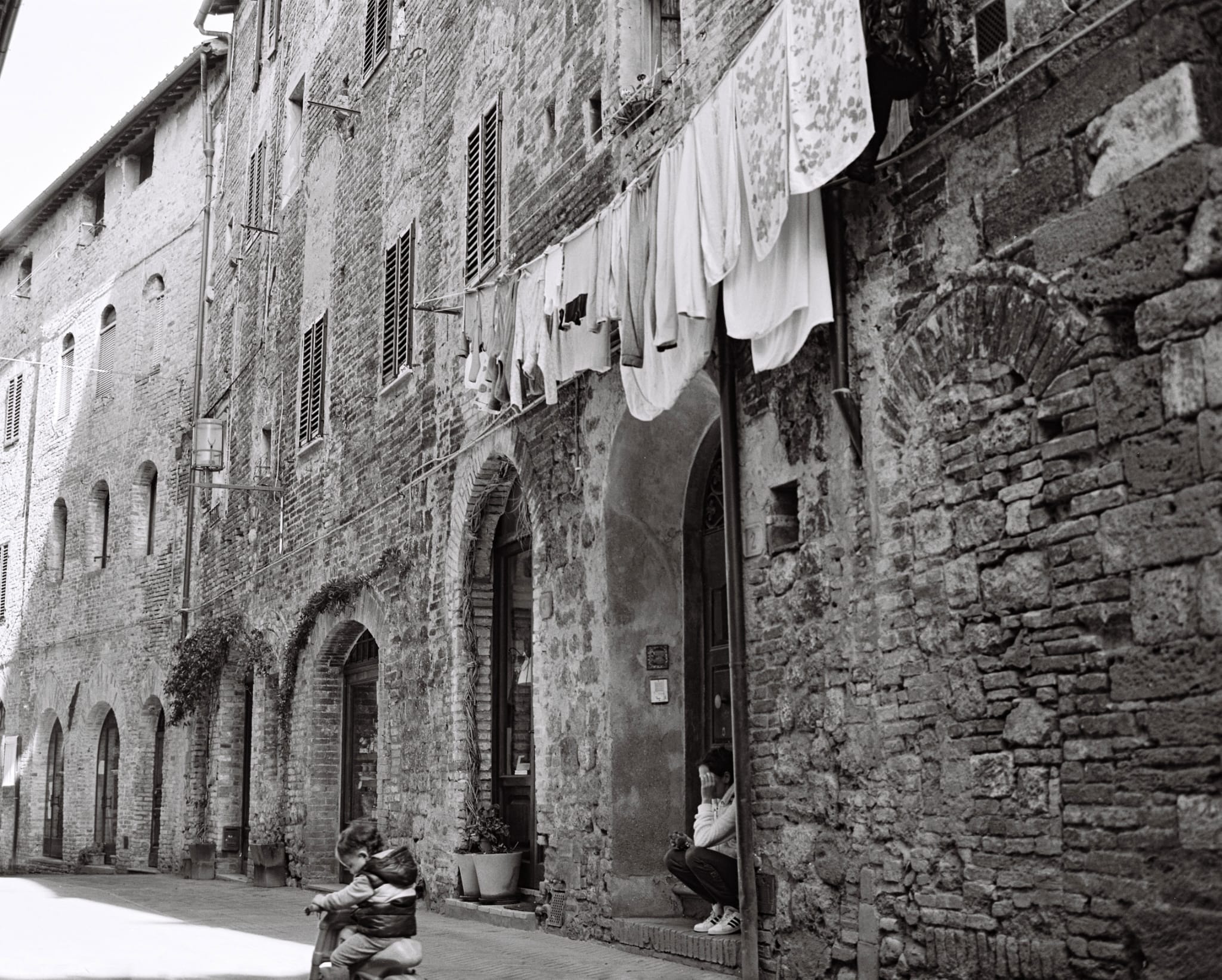
PHOTO4000 is a film photography course. More specifically, this course is an 8X10 film photography course. 8X10 cameras are large old-fashioned cameras. You might recall seeing a historic clip of people taking family photos with these where the photographer’s head is behind a drape attached to a large box with bellows that sits on a tripod. This course teaches the film shooting process, film development process, and printing process of 8X10. An experience that forges discipline, patience, and trains the eye. It is a rare opportunity to be able to use such a camera. After this course you will become a better photographer and the skills will have some carryover also when shooting on digital cameras.

Finally, FTVP3150 is a video production course. It goes into more detail about video making than EPMD1000. Students will learn the basic video shots and angles. They also learn to convey a message or theme using only 5 shots of 5 seconds called a 5X5. There are also projects such as a vlog that the course will teach. An amazing course If I may say so.

To give you an idea of the experiences involved, here is what the students had to say:

Roberto: “We stayed at an agriturismo, a sort of cute mini-hotel in the countryside. The night was pitch black because there were no artificial city lights. The air felt so clean and pollution-free. It felt nice to take a break from the urban life.”

Khalid “I am so grateful to have taken photos with an old-school 8X10 camera. It was awesome. I usually shoot on digital and now I enjoy film photography as well.”

Tamara “I have met many amazing people during this trip. It was great and exciting to make media projects with them.”

Student 4 “For me, one of the highlights of the trip was making fire oven pizzas.”

Conclusion: Basically what we are trying to say is to make sure not to sleep on this opportunity. In other words, we truly think you would enjoy it, so make sure to go next time Webster offers this.

Although I managed to get a few film photographs during the trip, I did also have a blank roll of film. Meaning, I took a bunch of shots when visiting the places but none of the photos came out when processing them. It was tough to digest. I made the mistake of not properly placing the film in the camera. Nonetheless, I certainly did not return from this trip empty-handed. Not only did I make nice videos and 8X10 photos, but I also gained a ton of knowledge about media production and met new people.